Bowel Cancer Screening Kit Capstone Project
University UX/UI Capstone Project 2023
Timeline:
12 Weeks
Area of Interest:
UX/UI Research and Design
My Role:
Group Student Project for University UX/UI Subject
Problem
Low participation rates for the current Australian National Bowel Cancer Screening Kit
The project we have been presented asks us to provide a design solution that targets 50-74 year old Australians in order to increase participation in the Bowel Cancer Screening Program. To do so, we will be required to investigate and analyse the current screening process, gain insight into the target audience through focus groups, conduct research of other existing screening programs, as well as investigate possible limiting factors that may hinder a persons ability to participate in the screening. Ultimately offering a design solution that delivers an increase in uptake and compliance while also catering to users needs with a human-centered design approach.
“We’re actively looking to increase participation rates and hopefully, retain the current users for future years also.”
Solution
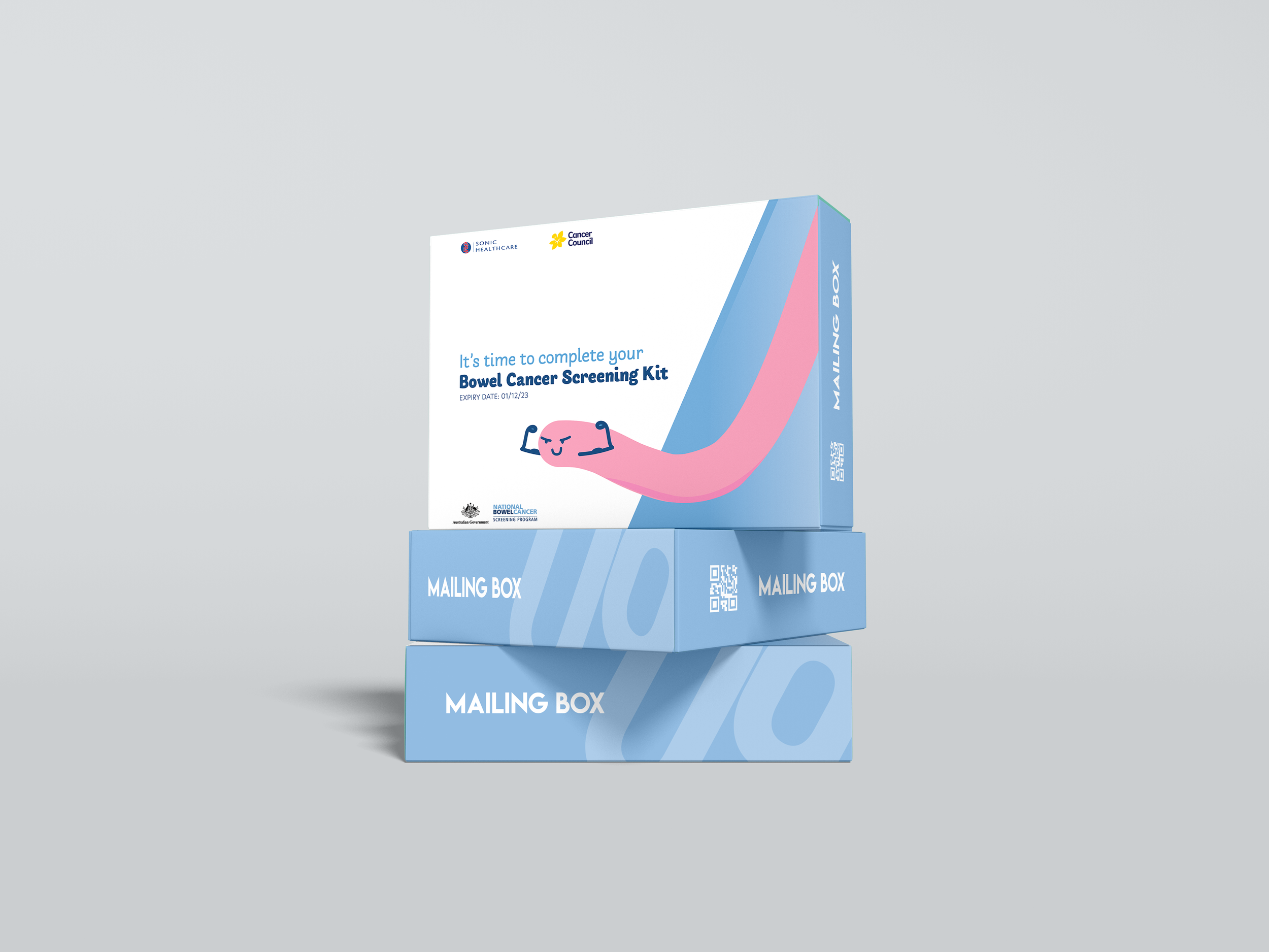
Creating a brand for the screening kit itself.
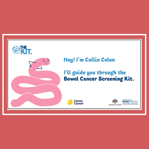
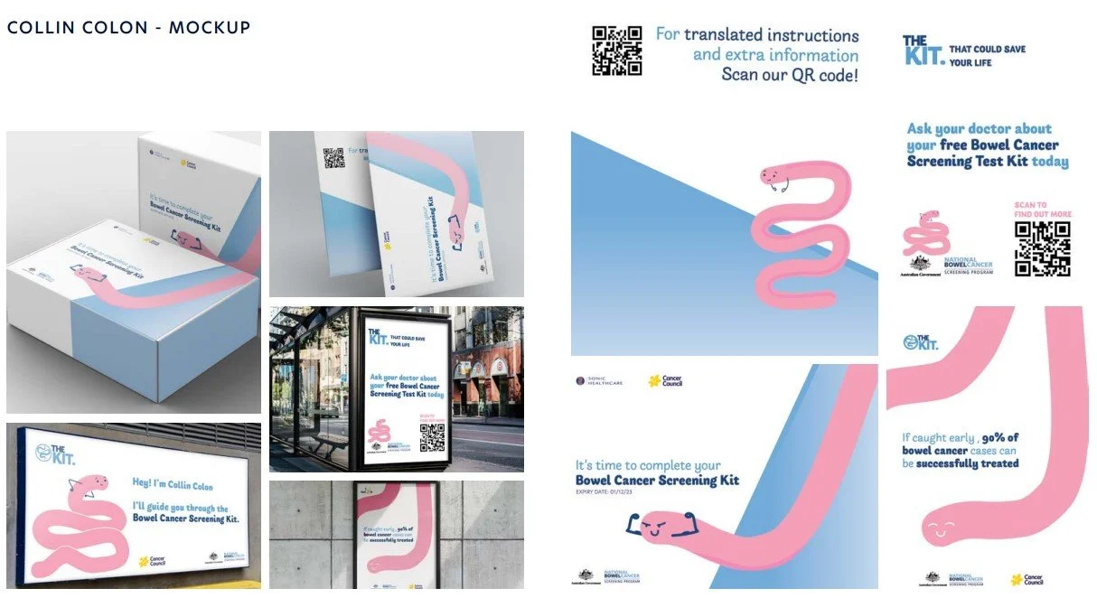
Meet Collin Colon, our new mascot!
Family friendly central figure that can be used for marketing, advertisments and general use
Relatable and memorable mascot that resonates well with a range of target ages and audiences*
Creates a friendly and inviting atmosphere around the kit
*according to focus group data interviews
Designed for the User
Redesigned packaging elements for better clarity and ease of use
Instructions made more consise and clear for readability
Visual design factors in accessability
and readability.
Keepin’ It Casual~
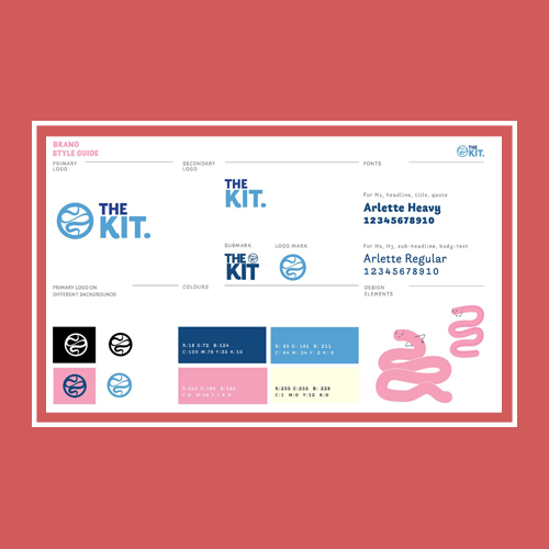
Revamped stylised branding focusing on bright colours and casual typefaces
Iconic styling to establish brand recognition
Dissasociates from government style branding
Research
Discovering what’s the Problem
Background Research + Competitive Analysis
Being a topic that I don’t have personal experience or relations within, a deep dive into the background of the National Screen Kit was required to discover any potential faults and improvements that can be made. In addition, to research other countries statistics and methodology when dealing with their own varients of screening kits.
Collaborative Group Research - Case Studies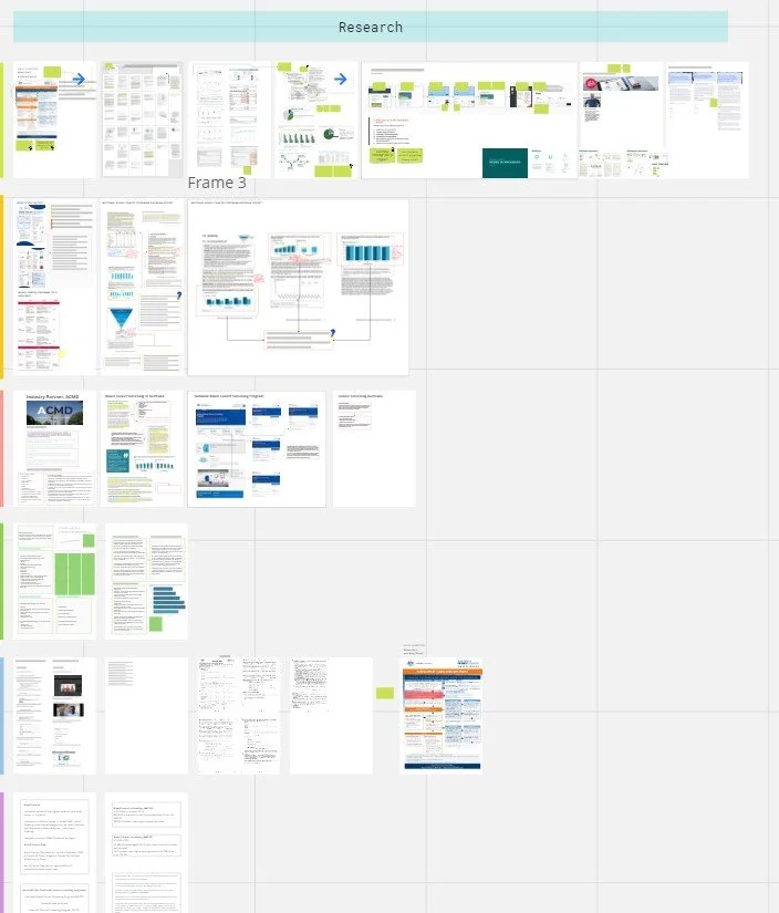
Focus Group
Common points of friction for individuals who did not complete the test are things such as: Procrastination - individuals who received the kit and wanted to put it off, whether it be through inavailability or laziness. People who ‘wanted to, but didn’t get around to it’, either forgetting or waiting too long and the kit expires. This was the largest factor as to why individuals did not complete the kit at over 60% of ‘non-completers’ stated that they ‘intended to complete the kit, but didn’t’.
Real World Interactions
Data Analysis
After conducting focus group interviews, with participants within our target demographic (aged 50-74), all the data was coallated between the groups and compiled into notes. Which were then broken down and analyised to discover common points of strengths or friction.
Empathy Mapping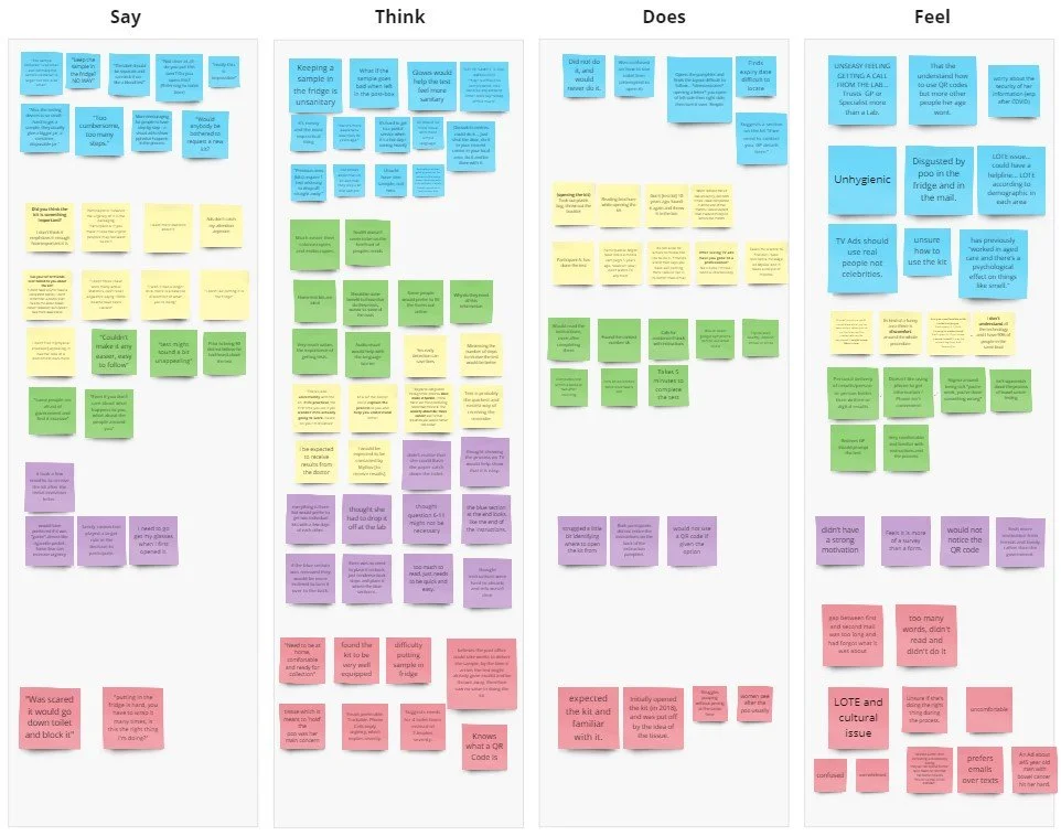
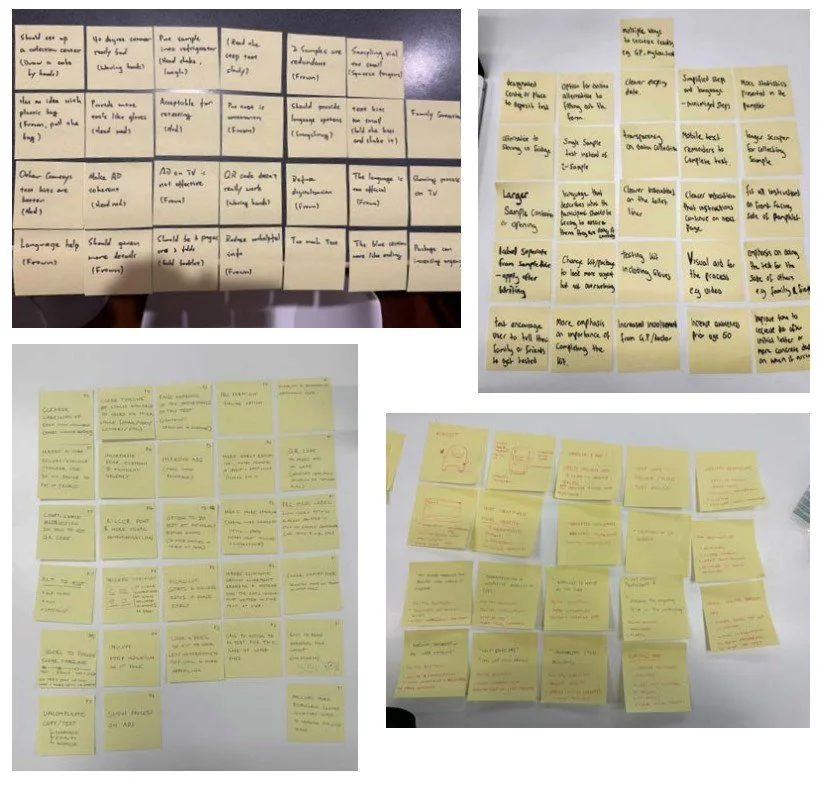
Sorted Data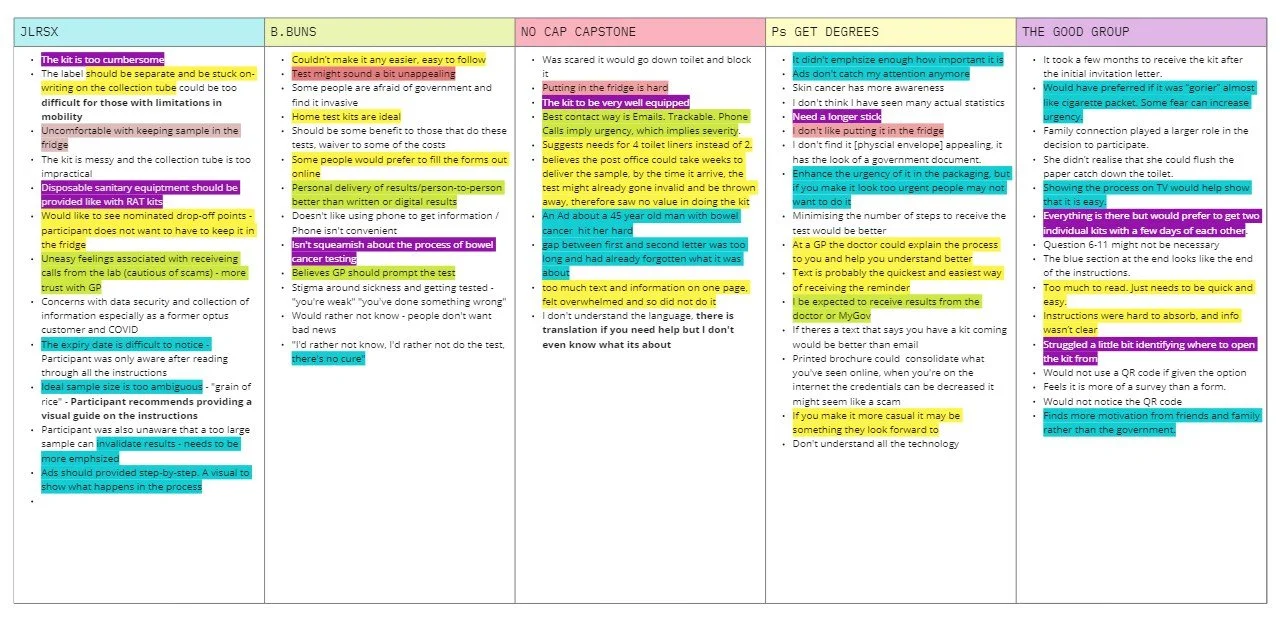
Insights
Time to pick a direction
“If only it didn’t look so intimidating and scary, it just makes me not want to do the kit. It feels somewhat stressful you know?”
After looking into the data and feedback that we collected, we began to generate some insights on the overall user and how we might want to move forward with the project. Ideas were generated between a more physical solution or a digital focused app/website experience that would hopefully achieve higher participation rates.
In the end we resulted that these were the key areas that we wanted to focus on, whilst developing a design solution.
Simple, visual and easy-to-follow instructions
Prioritise sanitation and hygiene
Destigmatised conversation around the kit
Better utilisation of the GP
Provide a better call-to-action from marketing
Mental Model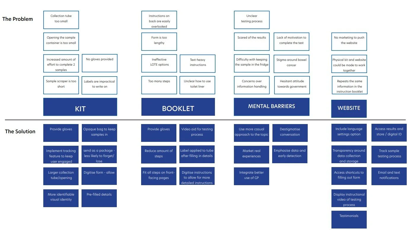
User Empathy Map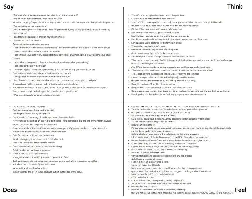
Initial Thoughts?
After we had thoroughly delved into the user and their needs with multiple exercises, as a team we discussed the possible routes that we were going to take to form our proposal and suggestions.
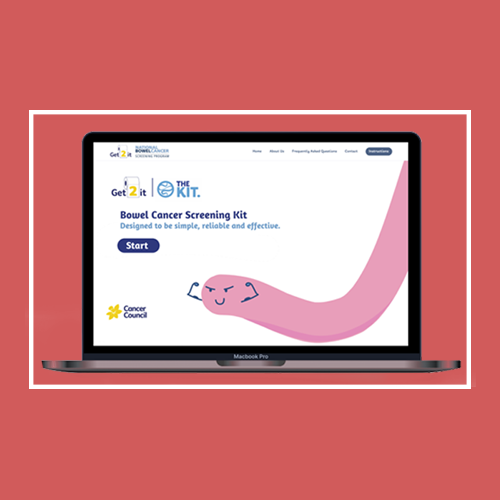
Through the sticky note exercise we were able to visualise our ideas and the direction we wanted to head in. In deliberation we ultimately decided that the most effective route we could go was to develop a website as our data indicated a preference for a website rather than using mobile solutions, an awareness campaign to promote the program as well as advertise the process and video instructions to act as a visual aid to the physical booklet. Overall, increase the audiences understanding of the screening program and the instructions as our data indicated confusion as a major barrier.
Design
Big, Bold, Bright and Memorable
As a team we decided that building a brand was our main ambition and goal for garnering higher participation rates. This approach was designed to feel impactful, accessible and more approachable than the current systems and infrastructure. We spent time deliberating on how to make it a digitial focused solution, but ultimately, decided to spend more time buidling a whole brand rather than a sole website/app that many users in the focus group interviews attested to. In addition, breaking down the current kit and revamping some of its key features, in its form and instructions, were also main points of friction for the user and had to be addressed.
Style Guide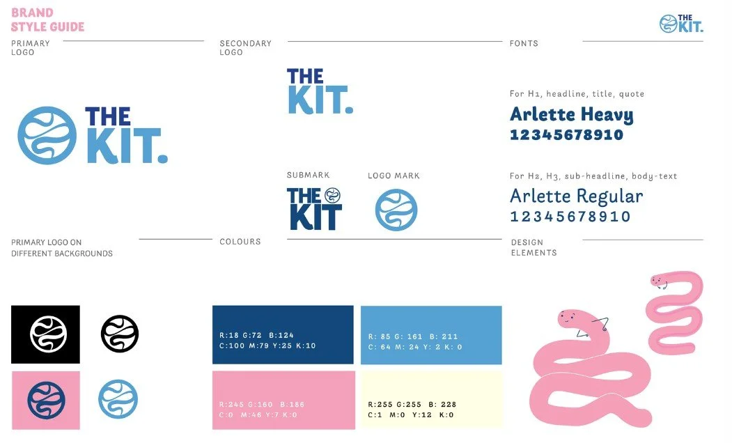
Redesigned InstructionsVideo GuideRedesigned Form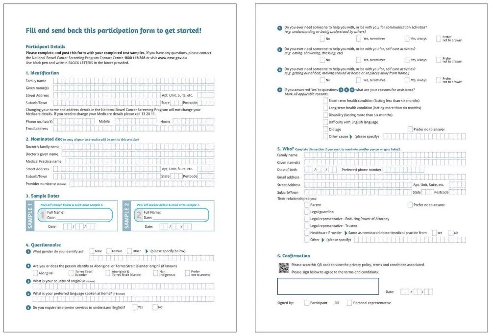

Branding MockupsInteractable Website Prototype (Click)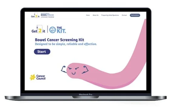
Reflections
What an experience!
Being my first proper experience doing a practical UX/UI Design Project, I had dived head first into exploring all the different avenues of research and design proccesses that it the field may encompass. The resulting project had definately opened my eyes to what I gravitate towards, my own sense of style and catching things that I didn’t even consider in the first place. Working in a team of 5 people also, for a project as large as this had its share of challenges and strengths that has certainly provided me with invaluable learning experiences. On that note the main key takeaways are:
Always communicate as much as possible:
Brainstorming and bouncing back ideas has never been so pronounced to me as it was in this project. Thinking alternatively and listening to fellow group members about their design ideology had only resulted in a more cohesive and strong group experience.Stick to the basics:
With so much pressure being my first practical capstone project, I ended up biting off abit more than I could chew, especially at the start of the experience. Going through the process just as I’ve researched and studdied has certainly grounded both myself and expectations.It’s just the beginning!
With a wrap up on my first project, I aspire to take my learnings from this capstone and apply it indefintely growing more and more on each project, whether it be for clientel or just conceptual! Onto the next~